9 colors that will make your repair more beautiful and visually more expensive
During the repair and decoration of the apartment, it is important to carefully choose the color palette. When choosing it, you need to take into account the combination of shades, the type of room, the area of the room and personally your preferences.
Lavender color
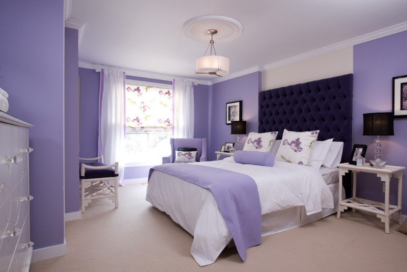
Lavender is considered a calm and relaxing color that brings magic and romance. When used correctly in the interior, it creates a cozy and elegant atmosphere. A win-win option would be a combination of white or dairy furniture with a delicate lavender hue - it will look harmonious and stylish. In small rooms it is better to use light colors, and bright and dark shades of lavender are recommended to be used as decor items to avoid narrowing the space.
White color
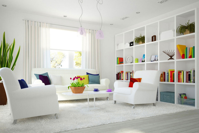
White color creates the main background on which you can create. By itself, this color is dull, but in combination with more saturated shades it looks stylish and original. Against a pastel background, expensive wooden furniture looks luxurious. A neutral hue focuses on furniture and decorative elements. White matte paint fills the room with light. The floor in pastel colors is very popular and has many advantages:
- gives coziness and comfort;
- rich appearance;
- It is combined with any decor.
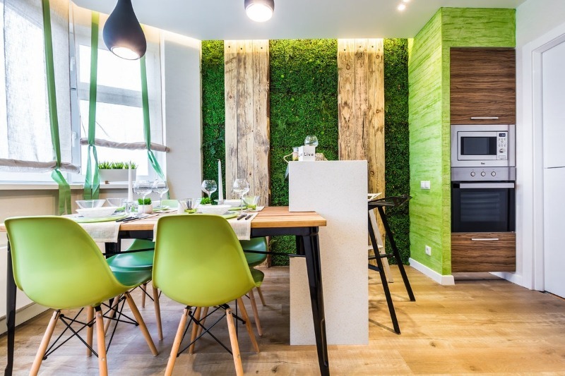
Natural, natural green color
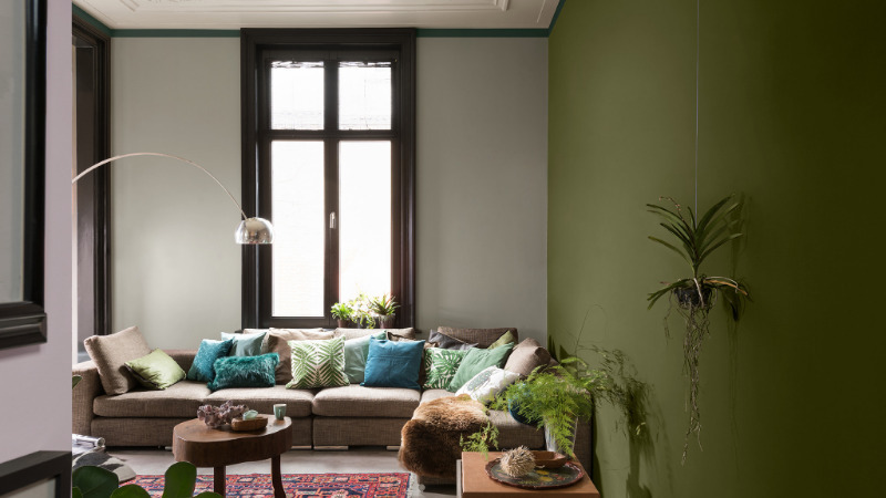
This shade has a positive effect on a person, helps to concentrate, gives relaxation. When combined with furniture and decor, it can serve as a good backdrop. Natural green color harmoniously combines with a cream shade, creating a calm interior. The main companions of green are yellow, beige, brown and orange. The combination of natural green with wooden furniture and decor gives a respectable look to the room.
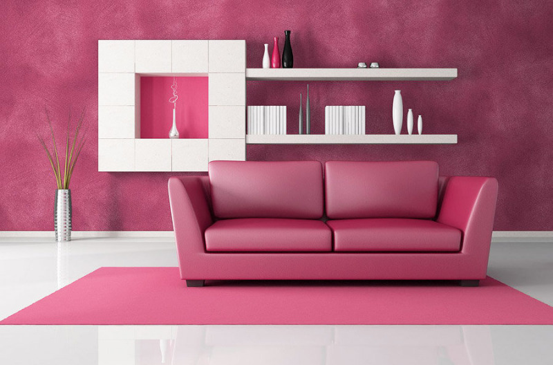
Dusty pink
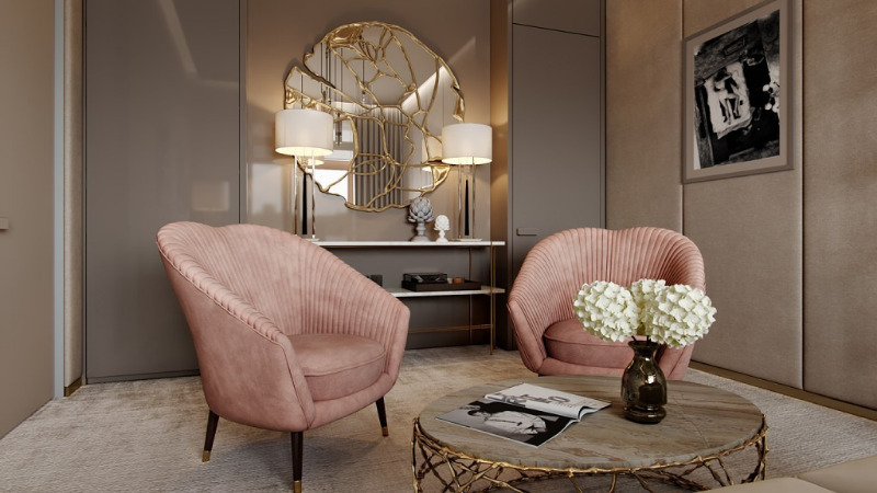
This color is especially popular in interior design. It creates comfort and combines with many shades. Apply this color in the following rooms:
- living room;
- bedroom;
- kitchen;
- bathroom;
- children’s.
The ash of the rose emphasizes marble, wood and looks great with a metal decor. The best companions for dusty pink: gray, blue, beige, white and black.
Dark blue
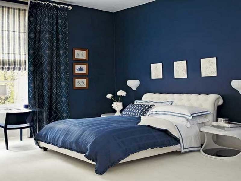
In combination with white, it is suitable for small rooms, as it visually expands the space. Dark blue should be diluted with other shades, for example such:
- cold shades of pink;
- beige tones;
- light shades of green;
- Gray;
- lilac.
Beige backgrounds and decorative navy blue accents are ideal for modern and classic styles.
Turquoise
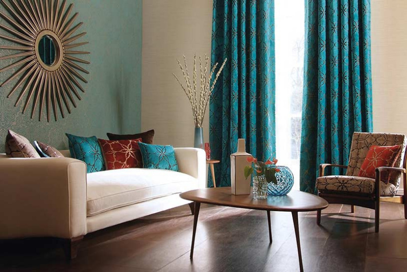
This color creates a cozy and comfortable atmosphere in the house. For vivid experiments with the selected rich color, a kitchen or bathroom is suitable. A combination of white walls and turquoise spots (plaid, curtains, pillows) will look stylish in the bedroom. A rich and restrained interior will turn out with the participation of turquoise with gold and silver. Minimal black decor will elegantly look in the turquoise interior.
Raspberry shade
When used correctly in the interior, this color will look bright, energetic and stylish. Do not use raspberry in a small room - it visually “steals” the space. A bad solution would be to add this color to the bedroom. Raspberry has a heavy load, it can be added in the form of small accessories. Raspberry-white combination is one of the most winning options.A great solution is to paint the wall in raspberry and add white furniture with decor, or vice versa. Raspberry shades successfully harmonize with pastel colors (add bright pillows and a plaid to a beige room).
Cream
One of the universal colors that are used for the background. Cream color is light and delicate: you can make the whole room out of its tones or take the background for more saturated colors. When creating a calm interior on a creamy background, dark chocolate-colored wood can serve as contrasting details, which makes the interior dull. Cream loves all pastel colors. For greater saturation, purple details are added to the cream room (textiles, jewelry, furniture, and so on). In classic versions, it is combined with light blue, which feels light and fresh. For natural interiors, cream color comes in a palette with pistachio, gray and sand.
Coal gray color
Exquisite color is suitable for any room. When combined with other shades of gray and white, the room will look stylish and tasteful. Charcoal gray best emphasizes the texture of materials in detail. Against the background of this color, metal elements (gold, silver, bronze and others) look expensive. The charcoal gray color can be used as a background for rich colors with interesting prints. For a relaxed interior, a combination with cream and beige shades is suitable.
With a competent selection of color solutions, you will get a stylish and luxurious interior, which will be pleasant to be in. Each room has its own acceptable color. Pay attention to details - they make the room attractive and set the mood.